Design Kit
Welcome to Nuxt design definition page. Identity was redefined by handpicking conscientiously colors, typography and shapes in order to put forward how performant, useful & easy Nuxt products are.
Logo History
The Nuxt logo has evolved gradually over time, but the mountain shape and wordmark have been constant elements in its design.


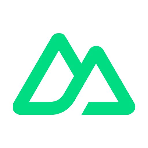
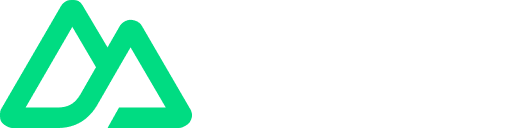
Nuxt Logo
The logo is made from two elements: the triangular mountains and the wordmark. In most cases, they should appear together as the opposite master lockup shows. The triangular mountains can be used on their own as an icon, profile picture or badge, but the wordmark should never be used without this symbol on the side.
Icon
Logo
Color Palette
Our color palette is based on our iconic Nuxt green and colours have been carefully considered to work in harmony and consistency across various media. When creating Nuxt communications, use the colour values shown to make sure your designs stay on-brand.
Green
#00DC82
White
#FFFFFF
Gray
#020420
DM Sans
Our brand typeface is DM Sans from Google Fonts. This typeface was chosen for its aesthetics, reminiscent of the shape of the Nuxt logo in many aspects (joints, apex, vertex of the structure). It offers modernity and sobriety while lending an iconic aspect to our visual content without compromising text accessibility.
Font is also variable which allows us to fit with any contexts.
DM Sans
The quick brown fox jumps over the lazy dog.
Usage
For Nuxt brand, we will only use Regular / Medium / Semibold weights 99% of the time. You should avoid Light & Heavy if you want to use it as Nuxt Identity. Only exceptions are for super, subscript characters, also you can use heavy if you go upper than 72px for a font size.